Stratfor Charts and Diagrams
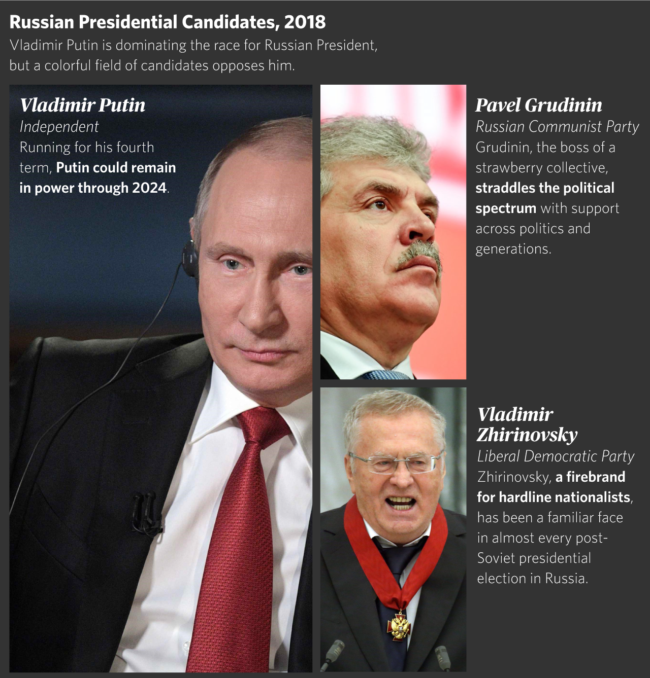
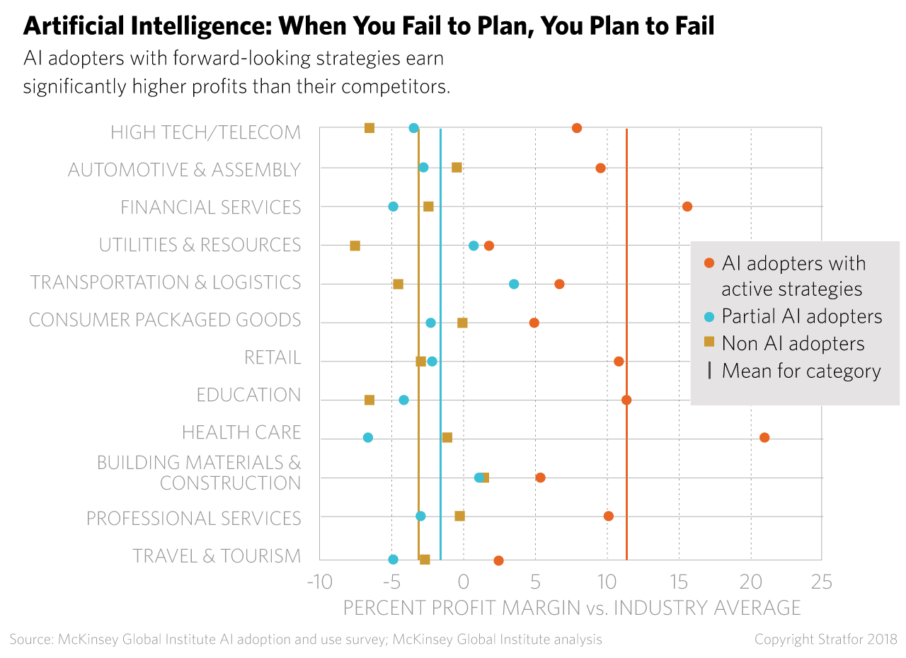
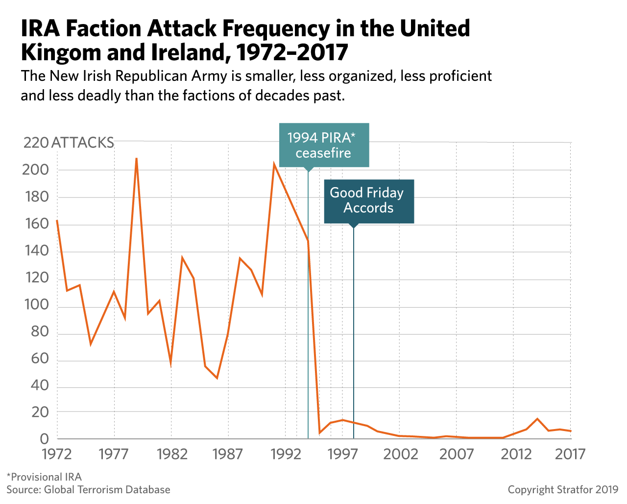
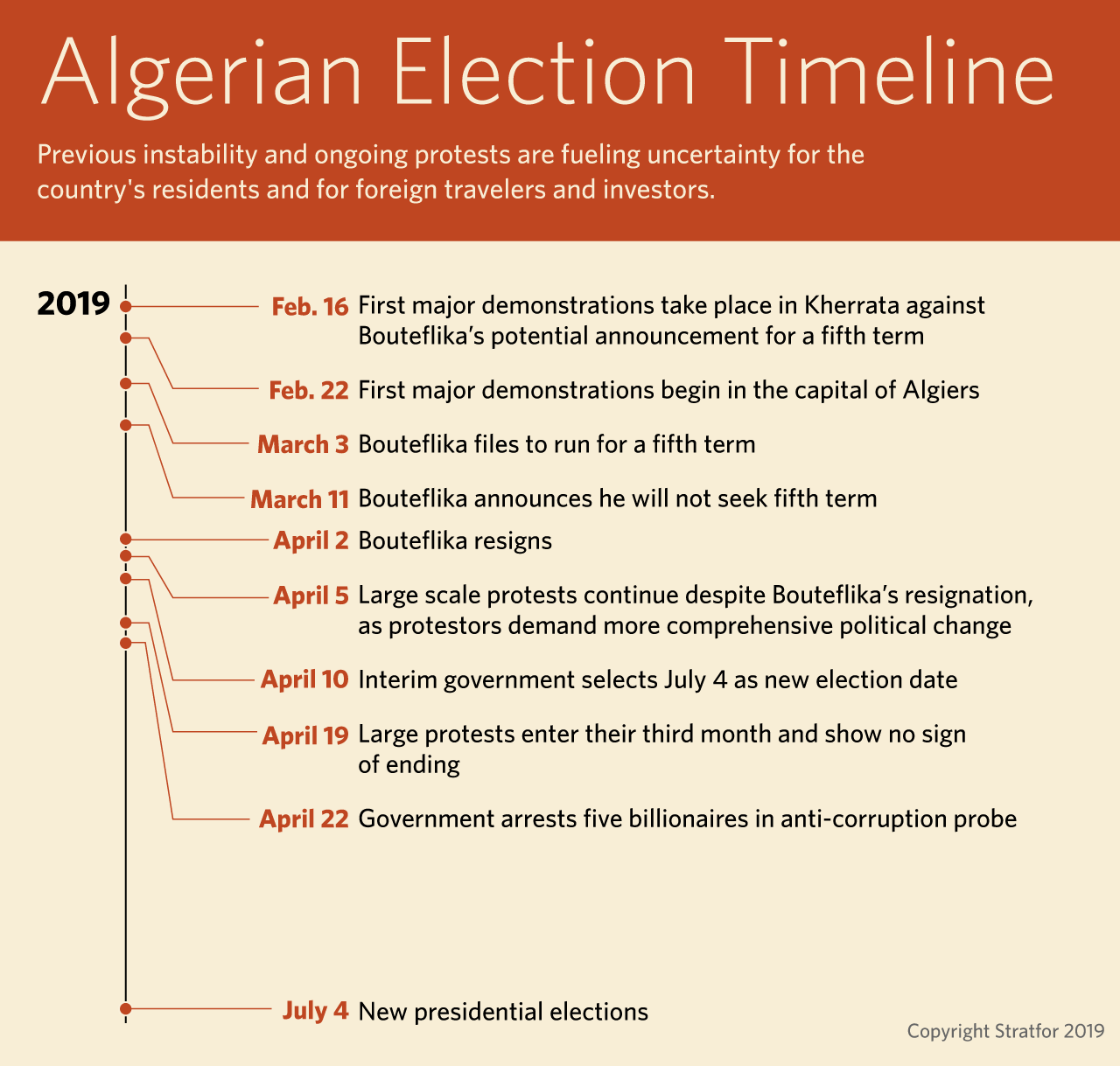
As a member of the design team for Stratfor, a leading global intelligence company, my role was to create clear and compelling graphics to illustrate the expert analyses of the company's geopolitical forecasting. One of the biggest challenges I faced was finding effective ways to visually represent complex data in a way that was easy for readers to understand.
Through my expertise in data visualization and design, I was able to create graphics that presented complex data in an intuitive and visually appealing manner. This involved a deep understanding of the underlying data, as well as an ability to communicate that data through the use of color, typography, and layout. By solving these design problems, I was able to create graphics that helped readers better understand the complex geopolitical landscape.
Client: Stratfor


Every good diagram should make the data clearer than an ordinary tabular presentation, or else should be discarded.

